design an AI diagnosis tool
Types
Design Challenge
Software Used
Figma
Timeline
48 Hours
Health App Case Study →
The Problem
After a launch goes live, Lisa is left with raw numbers and no clear signal about what's wrong or what to do next. An AI agent can diagnose the data and propose fixes — but the real design challenge is trust: how do you put an AI in the loop without the creator losing control of their own business?

Background
Create 3 screens for this challenge.1. Growth Diagnosis2. AI Recommendation3. Review & Approve
Objective
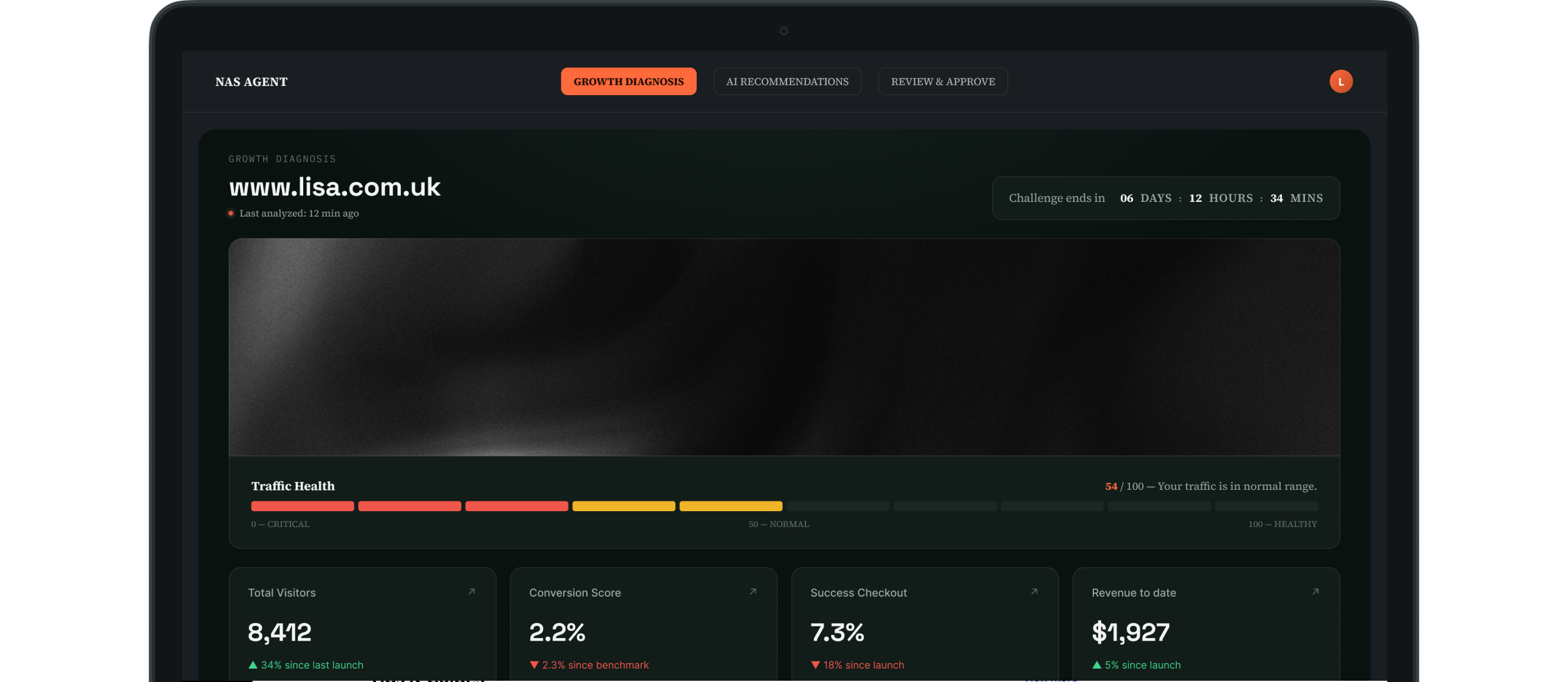
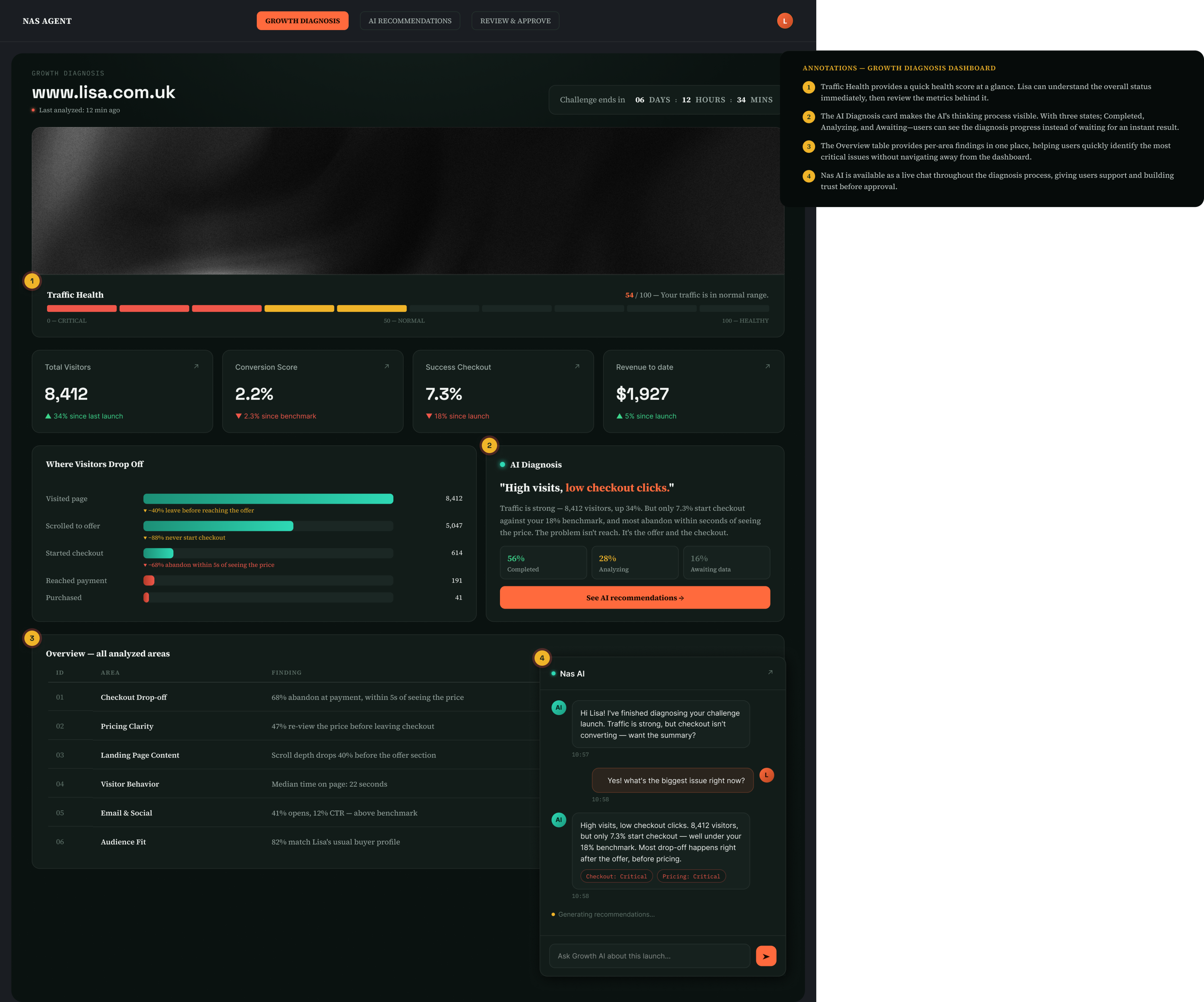
Lisa first sees a single Traffic Health score (54/100) instead of a table of metrics, giving her an instant understanding of the site's overall health. The six area tabs below help her prioritize issues, with the most critical area already selected and highlighted in red. A visual funnel shows exactly where visitors drop off, making the journey easier to understand than percentages alone.
The AI Diagnosis card displays live progress through three states: Completed, Analyzing, and Awaiting Data so users can see the AI working in real time instead of receiving an instant answer. A persistent chat panel is available from the diagnosis stage, allowing Lisa to ask questions and build trust throughout the process, not just when it's time to approve changes.
Objective
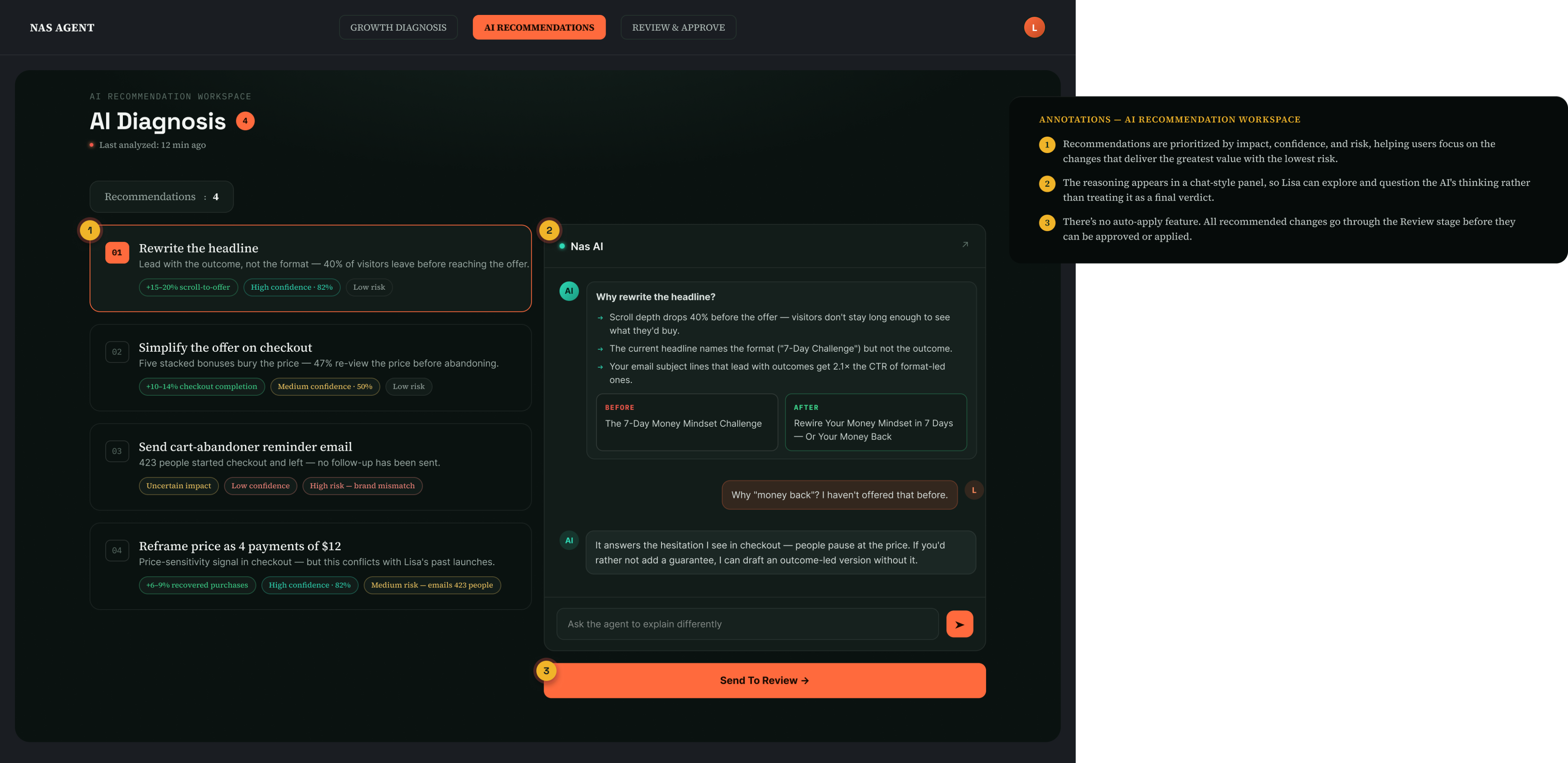
Recommendations are ranked by both impact and confidence, so the highest-value, lowest-risk changes appear first. Impact and confidence are shown separately, helping Lisa understand not only what matters most but also how certain the AI is about each recommendation. The reasoning is presented in a chat-style panel, with evidence first, followed by the recommendation and any important caveats. There’s no option to apply changes directly from this screen—the only next step is to send selected recommendations to Review.
Objective
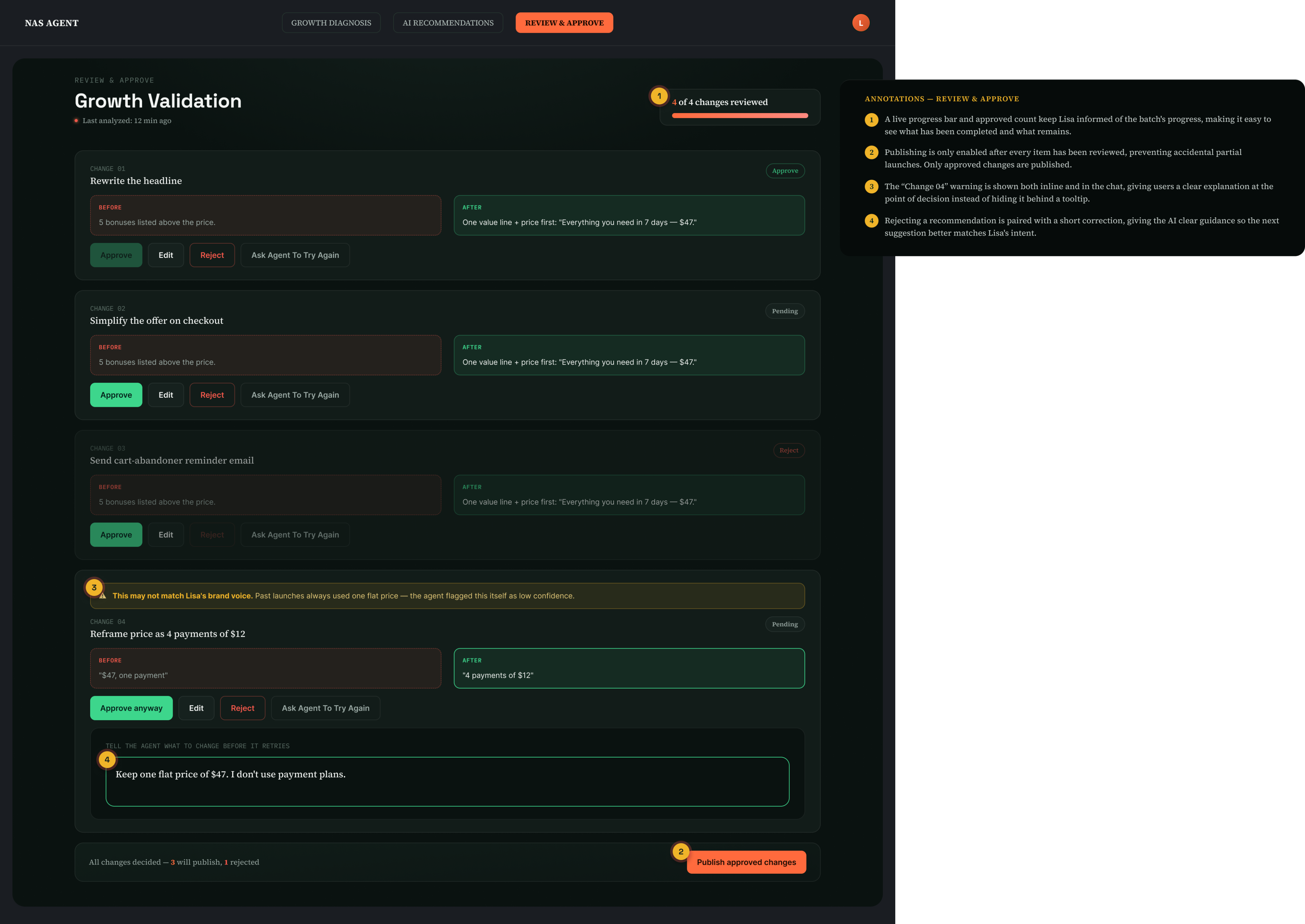
The message is clear: nothing is published without Lisa's approval. Every change is reviewed individually, and the Publish button stays disabled until all four changes have a decision, preventing accidental partial launches. For Change 04, the AI clearly flags its low confidence before Lisa reviews the recommendation, and the same explanation appears in the chat panel in plain language. If Lisa rejects a recommendation, she can provide a short correction before trying again, helping the AI generate a more accurate and useful recommendation instead of starting over blindly.
UI Rationale

Color Scheme: Dark theme with orange + teal accents
Orange signals action and primary decisions.
Teal signals the AI's voice, data evidence, and live status.
The two colors never compete — orange belongs to Lisa, teal belongs to the agent.
Label Behaviour
Instead of showing a number like "41% confidence," the design uses clear labels such as "Low Confidence" and "High Confidence."
Lisa can instantly tell which recommendations need extra attention without interpreting percentages.
The information stays the same, but it's easier to scan, reducing cognitive effort and helping her make faster decisions. Especially when reviewing multiple changes at once.
Health App Case Study →
let’s connect • design • work • let’s connect • design • work • let’s connect • design • work • let’s connect • design • work • let’s connect •
design an AI diagnosis tool
Types
Design Challenge
Software Used
Figma
Timeline
48 Hours
Health App Case Study →
The Problem
After a launch goes live, Lisa is left with raw numbers and no clear signal about what's wrong or what to do next. An AI agent can diagnose the data and propose fixes — but the real design challenge is trust: how do you put an AI in the loop without the creator losing control of their own business?

Background
Create 3 screens for this challenge.1. Growth Diagnosis2. AI Recommendation3. Review & Approve
Objective
Lisa first sees a single Traffic Health score (54/100) instead of a table of metrics, giving her an instant understanding of the site's overall health. The six area tabs below help her prioritize issues, with the most critical area already selected and highlighted in red. A visual funnel shows exactly where visitors drop off, making the journey easier to understand than percentages alone.
The AI Diagnosis card displays live progress through three states: Completed, Analyzing, and Awaiting Data so users can see the AI working in real time instead of receiving an instant answer. A persistent chat panel is available from the diagnosis stage, allowing Lisa to ask questions and build trust throughout the process, not just when it's time to approve changes.
Objective
Recommendations are ranked by both impact and confidence, so the highest-value, lowest-risk changes appear first. Impact and confidence are shown separately, helping Lisa understand not only what matters most but also how certain the AI is about each recommendation. The reasoning is presented in a chat-style panel, with evidence first, followed by the recommendation and any important caveats. There’s no option to apply changes directly from this screen—the only next step is to send selected recommendations to Review.
Objective
The message is clear: nothing is published without Lisa's approval. Every change is reviewed individually, and the Publish button stays disabled until all four changes have a decision, preventing accidental partial launches. For Change 04, the AI clearly flags its low confidence before Lisa reviews the recommendation, and the same explanation appears in the chat panel in plain language. If Lisa rejects a recommendation, she can provide a short correction before trying again, helping the AI generate a more accurate and useful recommendation instead of starting over blindly.
UI Rationale
Color Scheme: Dark theme with orange + teal accents
Orange signals action and primary decisions.
Teal signals the AI's voice, data evidence, and live status.
The two colors never compete — orange belongs to Lisa, teal belongs to the agent.
Label Behaviour
Instead of showing a number like "41% confidence," the design uses clear labels such as "Low Confidence" and "High Confidence."
Lisa can instantly tell which recommendations need extra attention without interpreting percentages.
The information stays the same, but it's easier to scan, reducing cognitive effort and helping her make faster decisions. Especially when reviewing multiple changes at once.
let’s connect • design • work • let’s connect • design • work • let’s connect • design • work • let’s connect • design • work • let’s connect •
design an AI diagnosis tool
Types
Design Challenge
Software Used
Figma Design, Claude Design
Timeline
48 Hours
Health App Case Study →
The Problem
After a launch goes live, Lisa is left with raw numbers and no clear signal about what's wrong or what to do next. An AI agent can diagnose the data and propose fixes — but the real design challenge is trust: how do you put an AI in the loop without the creator losing control of their own business?

Requirements
Create 3 screens for this challenge.1. Growth Diagnosis2. AI Recommendation3. Review & Approve
Growth Diagnosis
Lisa first sees a single Traffic Health score (54/100) instead of a table of metrics, giving her an instant understanding of the site's overall health. The six area tabs below help her prioritize issues, with the most critical area already selected and highlighted in red. A visual funnel shows exactly where visitors drop off, making the journey easier to understand than percentages alone.
The AI Diagnosis card displays live progress through three states: Completed, Analyzing, and Awaiting Data so users can see the AI working in real time instead of receiving an instant answer. A persistent chat panel is available from the diagnosis stage, allowing Lisa to ask questions and build trust throughout the process, not just when it's time to approve changes.
AI Recommendation
Recommendations are ranked by both impact and confidence, so the highest-value, lowest-risk changes appear first. Impact and confidence are shown separately, helping Lisa understand not only what matters most but also how certain the AI is about each recommendation. The reasoning is presented in a chat-style panel, with evidence first, followed by the recommendation and any important caveats. There’s no option to apply changes directly from this screen—the only next step is to send selected recommendations to Review.
Review & Approve
The message is clear: nothing is published without Lisa's approval. Every change is reviewed individually, and the Publish button stays disabled until all four changes have a decision, preventing accidental partial launches. For Change 04, the AI clearly flags its low confidence before Lisa reviews the recommendation, and the same explanation appears in the chat panel in plain language. If Lisa rejects a recommendation, she can provide a short correction before trying again, helping the AI generate a more accurate and useful recommendation instead of starting over blindly.
UI Rationale
Color Scheme: Dark theme with orange + teal accents
Orange signals action and primary decisions.
Teal signals the AI's voice, data evidence, and live status.
The two colors never compete — orange belongs to Lisa, teal belongs to the agent.
Label Behaviour
Instead of showing a number like "41% confidence," the design uses clear labels such as "Low Confidence" and "High Confidence."
Lisa can instantly tell which recommendations need extra attention without interpreting percentages.
The information stays the same, but it's easier to scan, reducing cognitive effort and helping her make faster decisions. Especially when reviewing multiple changes at once.
let’s connect • design • work • let’s connect • design • work • let’s connect • design • work • let’s connect • design • work • let’s connect •